I know it’s sacrilegious for a long-time Spider-Man nut like myself to say this, but I haven’t always been the biggest fan of Steve Ditko’s artwork. Yes, he’s the man who is personally responsible for giving visual life to my favorite superhero and his incredible cast of characters. But I often found that Ditko’s dense plotting came at the expense of the comic’s overall artwork – an issue that was later cleaned up when John Romita Sr. took over on pencils for Amazing Spider-Man #39.
Still, when Ditko was given an opportunity to cut loose, he produced some truly memorable artwork that ranks among my favorite Spider-Man visuals of all time. Most notably, Ditko’s splash pages are a thing of beauty. The artwork is a little off-beat and quirkier than Romita’s focus on realism, but these pages also have a knack (with the help of some Stan Lee text) of telling the entire story of the forthcoming comic in a single visual.
In interest of ending my Cold War against Ditko, I picked today (for honestly no reason other than I thought today was as good a day as any) to celebrate Ditko’s greatest (in my opinion) splash pages.
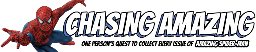
10. Amazing Spider-Man #26
One of the greatest mysteries of ASM’s earliest issue was the identity of the Green Goblin, a villain who would go on to become one of Spider-Man’s most nefarious adversaries. Simultaneously, Lee and Ditko were teasing the secret identity of another villain, the Crime-Master. In this splash page, I really appreciate the whimsy of juxtaposing the two villains (and Frederick Foswell, who Spider-Man had thought was one of the two villains) with Spidey sitting there on a question mark, looking inquisitively. The visual accentuates the importance of the mystery, while also setting the tone for a fun little caper.
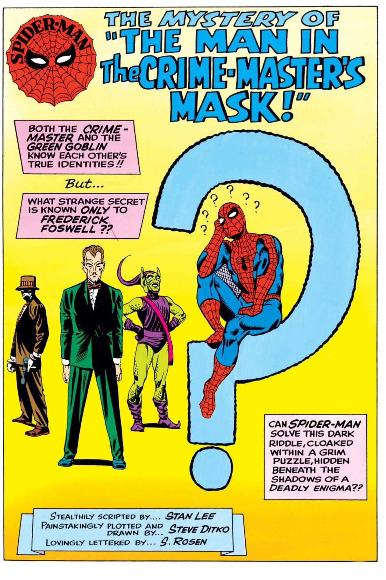
9. Amazing Spider-Man #18
 “Yellow Journalism” at its finest. I’ve long been a sucker for newspaper imagery, but beyond just that, that Cheshire Cat grinning J. Jonah Jameson sells the whole thing for me. It’s like a crooked Uncle Sam pointing at me and telling me he wants me to buy the Daily Bugle and agree with him about what a menace this Spider-Man guy is. If someone who never read a Spider-Man comic book asked me to describe JJJ, I would probably just show them this panel and let Ditko’s art do all the talking.
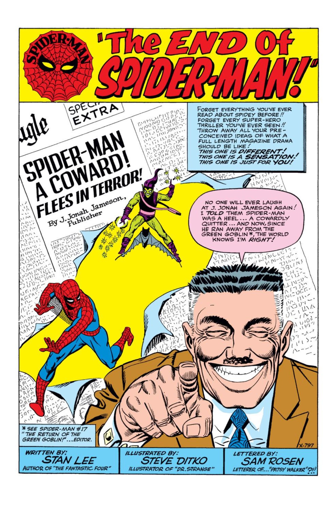
8. Amazing Spider-Man #10
 The Enforcers went on to become C-to-D-level villains in the Spider-Man universe, but at the time of their introduction, they were the first super team of goons to take on Spider-Man. Spidey had a hard enough time dealing with just Sandman or Electro, how was he going to take on four guys at once? I love the ominous menace of this visual, which is brought home by a defeated looking Spider-Man in the foreground who has a gun pointed at his back side courtesy of the mysterious Big Man. Plus, Fancy Dan. That is all.
7. Amazing Spider-Man #12
 All of Spider-Man’s trials and tribulations captured on a single page. Angst-filled teenager worried about his secret identity getting exposed? Check. Unique, one-of-a-kind supervillain? Check. Quirky supporting cast of scowling/smiling teenagers and old women? Check. Newspaper editor slandering our hero? Check. Jungle animals? Well, we don’t usually need jungle animals, but hey, that’s Ditko/Lee Spider-Man for you! Check!
6. Amazing Spider-Man #1
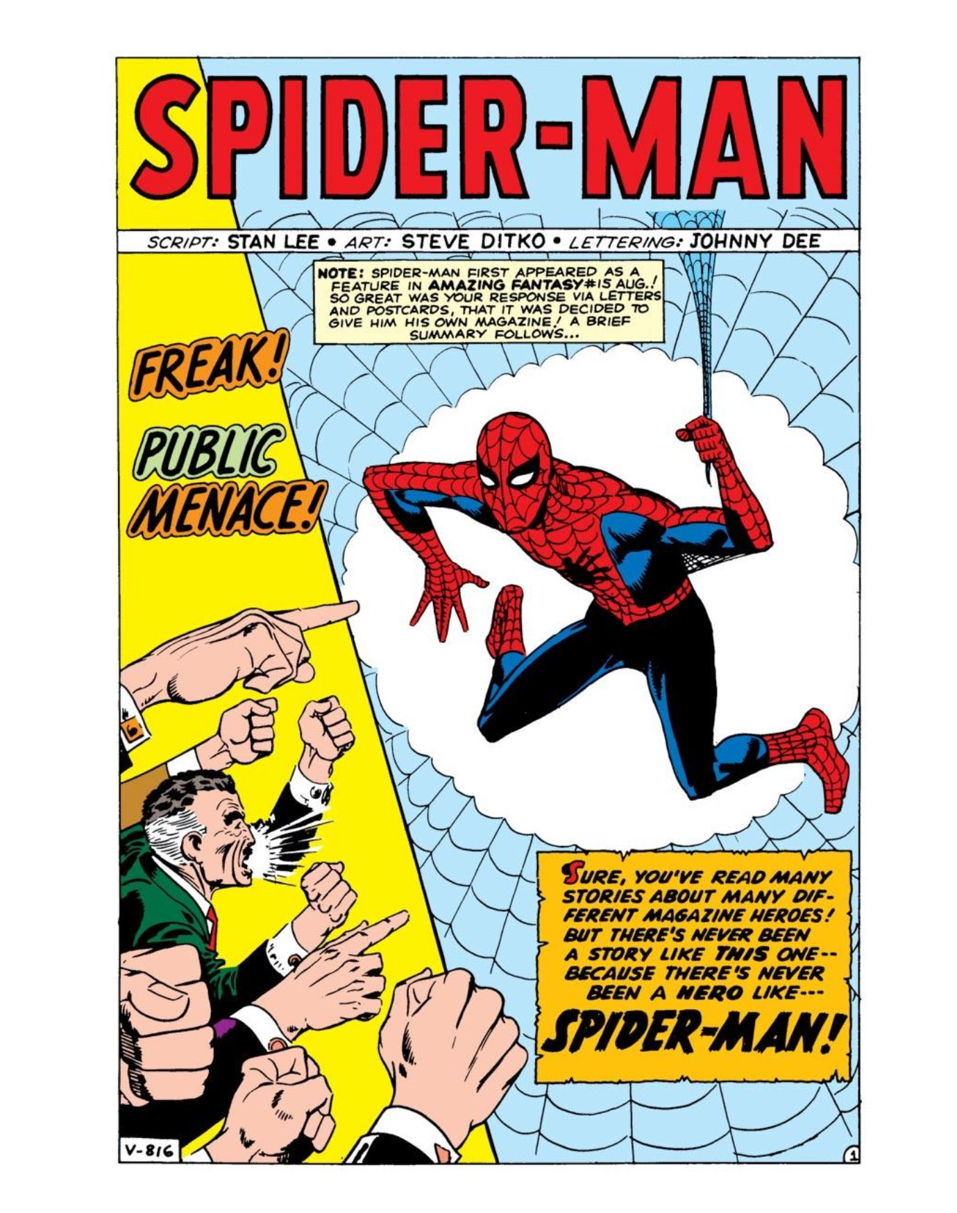
The first visual appearance of JJJ and of course the panel that establishes one of the most important recurring themes of Spider-Man comic books: unlike other superheroes in the Marvel universe, the public views Spider-Man as a “freak” and a “menace.” You have to remember that in 1963, this was such a mind-blowing concept for a superhero comic book. Think about it … there’s a brand new comic book on the rack about a geeky teenager who’s own ego led to the death of his Uncle, and Marvel twists the knife in Peter’s back even more by turning him into a vigilante anti-hero in the eyes of the public. Genius.
5. Amazing Spider-Man #24
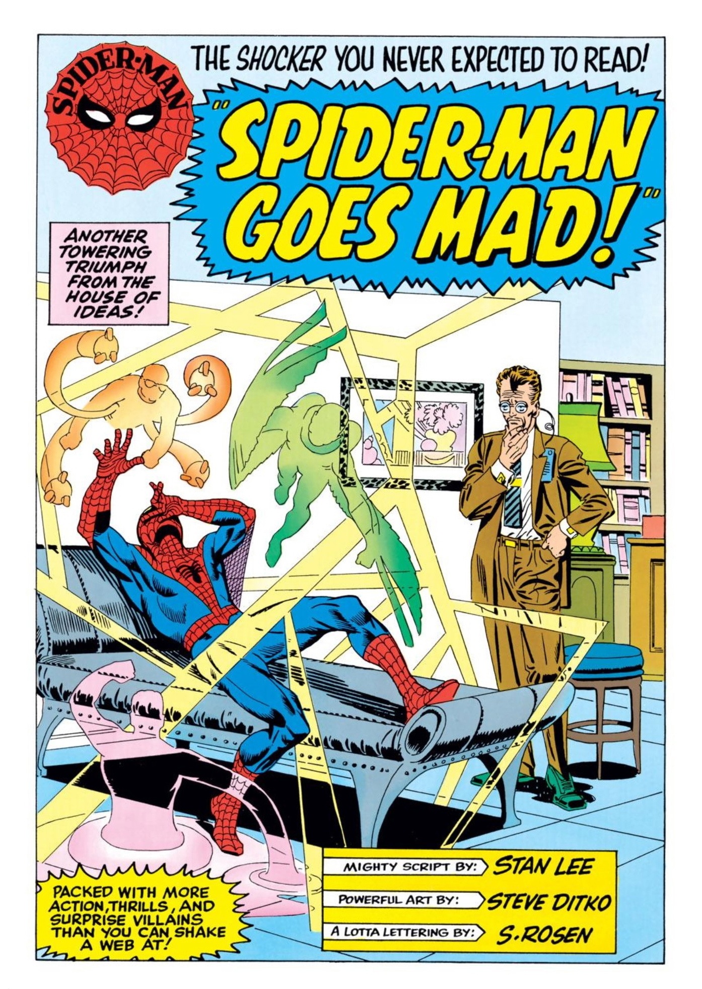
Ditko follows up one of his best covers ever with an even neater interior visual of a Spider-Man going batty. It’s such a startling image seeing Spidey languishing on a psychiatrist’s couch with the spectre of some of his greatest villains enclosing him in what almost looks like a laser light show-cage. Similar to the ideas presented in ASM #1, what publisher in their right minds would suggest that their superhero needs help from a shrink? Marvel, that’s who. If you’re not interested in turning the pages after seeing this splash page, then you probably shouldn’t be reading comic books.
4. Amazing Fantasy #15

The image of the shadowy specter of Spider-Man ominously looming behind Peter Parker is one that’s been used in varying degrees by a number of Spider-Man artists (including one who used this visual theme to craft what may be the greatest comic book cover of all-time). While Ditko sometimes had a problem drawing realistic-looking teenagers (at least when compared to JRSR), the genre-defining visual on the right side of the page more than makes up for how Archie-fied Flash Thompson looks here.
3. Amazing Spider-Man #28
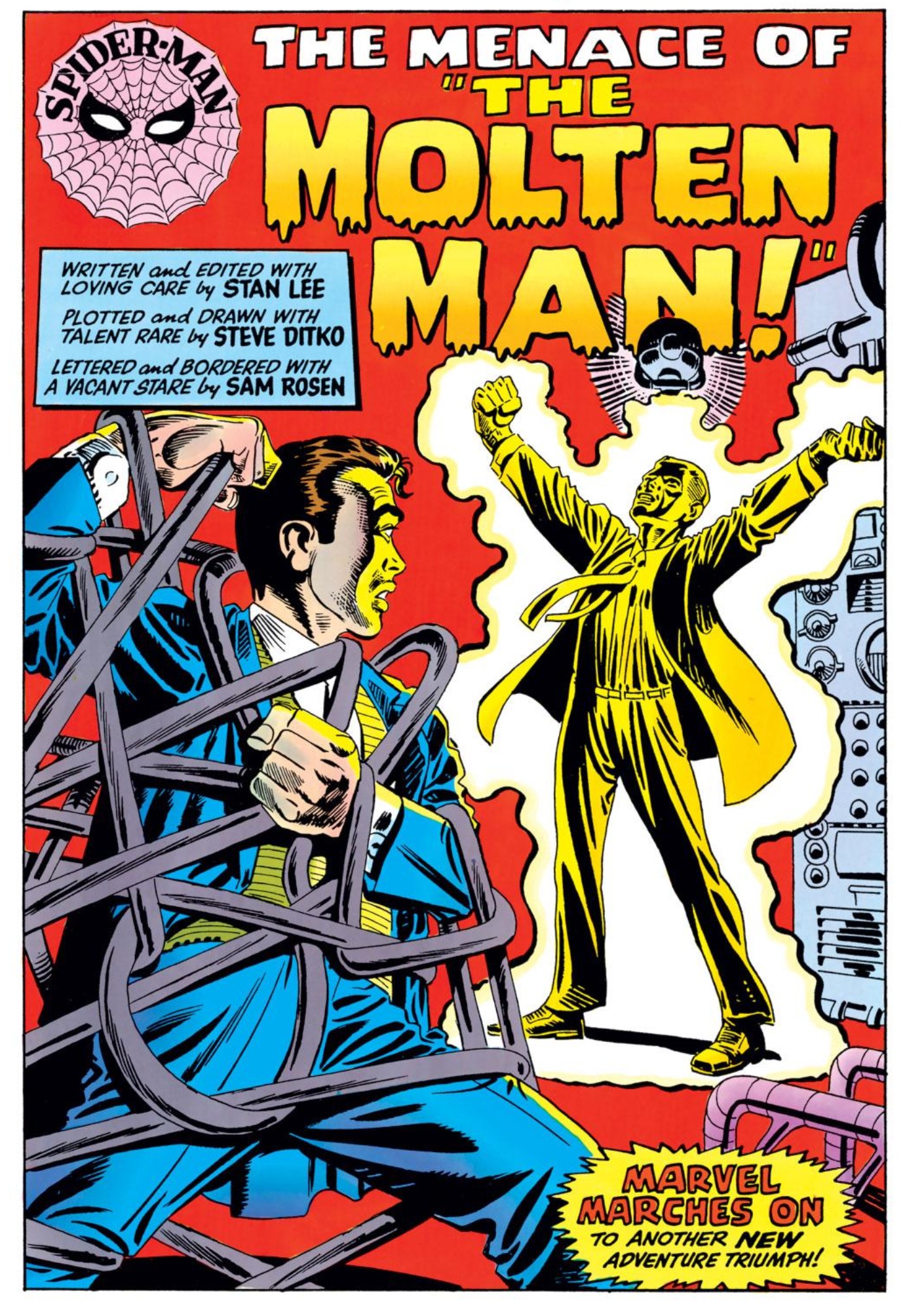
This one is all about the eerie aesthetic for me. Ditko got his start in the comic book world drawing monster magazines like Strange Tales and Journey into Mystery. This splash page, which marks the debut of the strange Molten Man, feels like a throwback to the monster mag era. With its saturated reds and yellows, I feel like the panel should be introducing a Frankenstein monster or a werewolf from “beyond the grave” or something to that effect. It’s just so completely different, yet simultaneously vintage (vintage for 1965, of course) that I can stare at this image all day and find new things I love about it.
2. Amazing Spider-Man Annual #1
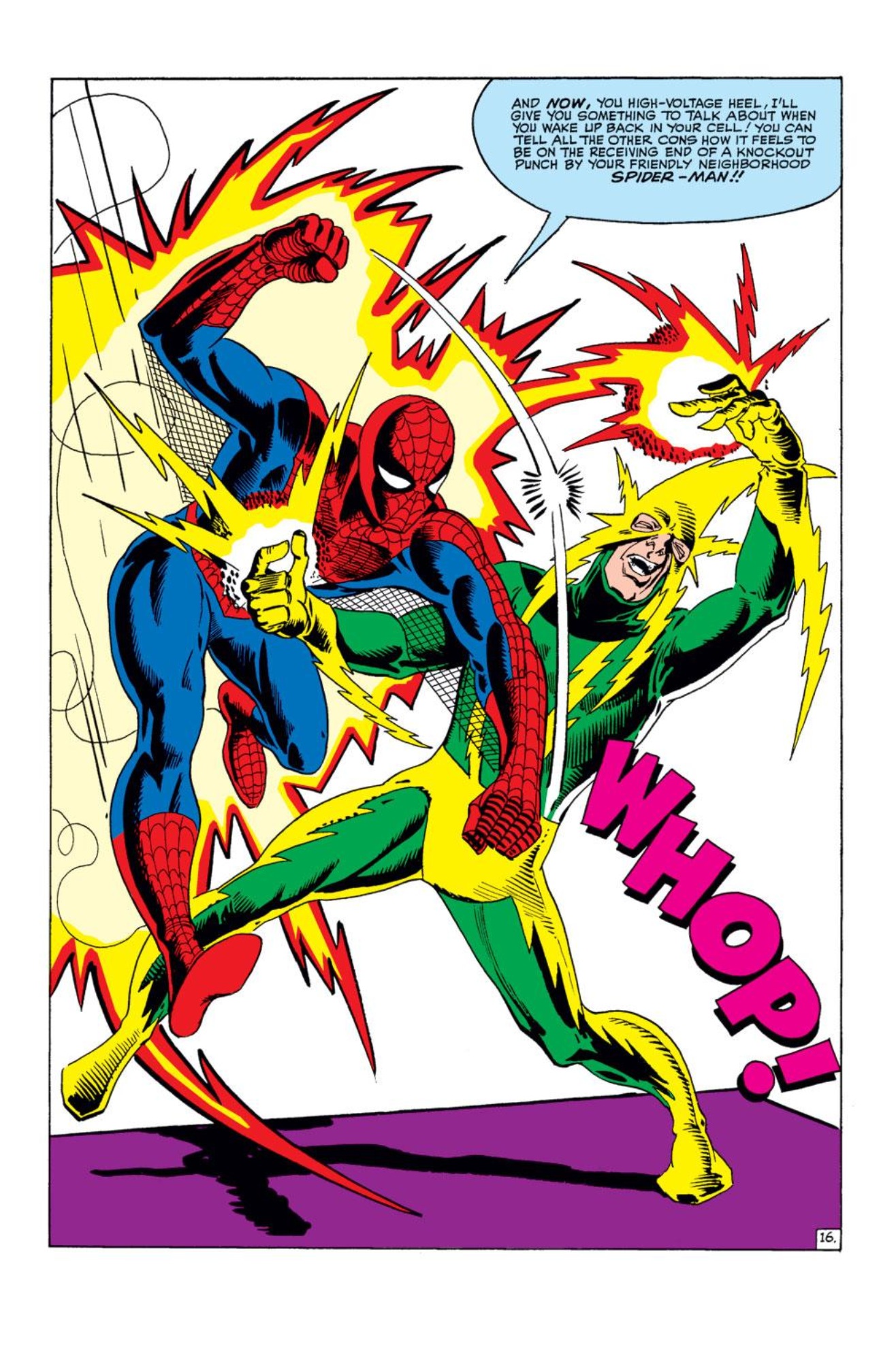 Take your pick here. We have six villains (the Sinister Six) and each one has their own splash page dedicated to them. I decided to go with the Electro image because I love the red and yellow electricity visual on the left side of the page, especially when contrasted with the starkness of the white background. Of course, you also can’t go wrong with the Kraven the Hunter, Mysterio, Vulture or Sandman pages. The only one I think is lacking is the Doctor Octopus, primarily because seeing Otto in SCUBA gear is just silly to me. But these images are an example of just how great an artist Ditko could be when given the opportunity to just totally cut loose. From an art perspective, he treated this annual as a showcase, stuffed to the gills with pin-up pages. There’s an attitude to this artwork that would even put Todd McFarlane to shame.
1. Amazing Spider-Man #4
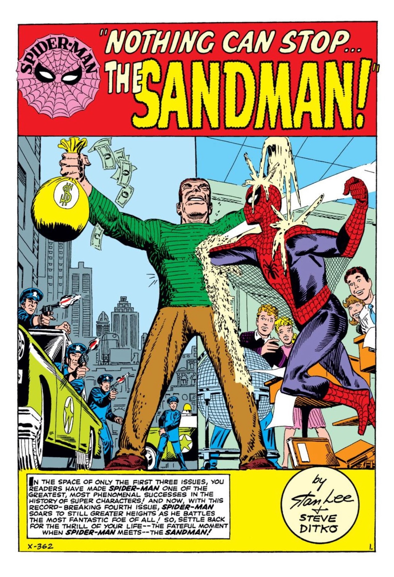
While Sandman may not be the greatest villain Spider-Man has ever faced, I think he’s the most interesting visually. A man made completely out of shape-shifting sand stirred Ditko’s creative juices. The image of Spider-Man landing a punch and getting stuck inside Sandman’s torso is truly iconic, and was referenced years later in Sam Raimi’s otherwise underwhelming Spider-Man 3 movie. But poor sequels aside, this splash page captures Sandman as a true force of a nature. These were the kinds of interesting and bizarre supervillains that set Marvel apart from the Distinguish Competition in the 1960s. Any visual that can encapsulate an entire movement in comics is certainly good enough to clock in at No. 1 on my humble little list.
Check out some more great Steve Ditko artwork on my Ditko gallery on Pintrest
All images from Marvel Comics created by Stan Lee & Steve Ditko

Good picks. I was gonna be pissed if you left out the splashes from Ann #1! I know it’s a cover, but one piece of Ditko’s art that has grown on me over the years is the cover to Ann. #2. At first I didn’t like the yellow background but the various Spidey poses are pretty cool.
Yeah, I cheated by grouping all of the Annual splashes into one entry, but that was more in the interest of getting a few different kinds of visuals in there. I really enjoy some of the more narrative splashes like ASM #26 and ASM #12 and wanted to make sure they had representation.
I love this blog, I would to begin with that.
Always go to love Ditko’s art but I’ve always thought that his left hand looks very uncomfortable on the Amazing Spider-Man#1 Splash page.
I didn’t say this in the blurb but I always felt Spidey there mirrored a marionette doll which explains the awkward pose.
Ditko is the best. An honorable mention should go to issue 37, with a giant, bemused-looking Peter Parker studying his supporting cast as they amble about a web-shaped gameboard. So Ditko.
Can I ask what reprint edition those scans are from? I like the coloring.
Cass the images here are screen grabs courtesy of the Marvel U iOS app.
Mark,
Being a tremendous fan of Mr. Ditko, and having written about his work over the years I appreciated your focus on these exceptional splash pages. Even though I’ve looked at them innumerable times over the decades the focus on them here pointed out how innovative and varied they were. There is always more to study and appreciate in Ditko’s work, which is why he is one of the greats in the field of comic art.
steve ditko was the first spider-man artist and remains the best.his art remains compelling and unique.the sandman cover for me is the most chilling and engaging.brilliant work steve.
His odd eccentric syle. Who else could draw a “spider-man” ?
The cover of Spider-man #18 … it’s … BEYOND. Just Ditko working overtime or something. Construction, setting, atmosphere, dynamism, suspense, texture, color. All the elements on MARK. Just BEYOND. It’s the only word I can use to describe it.
Steve Ditko’s art work is great but, I would loved to see him work with Murphy Anderson’s inking.
As far John Romita Sr. work on Spiderman, it’s all wrong and every other artist has followed suit even the cartoon. Spiderman’s webbing twist around his arm and over his shoulder also above his shoulder blade. No one has got it wright since Ditko. I could say the same or DC’s Flash the art work sucks!
Clavon,
Know what you mean about Ditko’s Spider-man. His is the definitive version. It’s like Jack Kirby told me. (NAME drop) Steve Ditko made Spiderman Spider-man.
And while were at it Carmine Infantino made the Flash the Flash. He’s Streamlined. NOT yet another muscle-bound steroid case!
steve ditko MIGHT be a much better artist if he tried to be.